Visualizing Hurricanes
October 9, 2015

On September 27th, Hurricane Joaquin, a Category 4 storm developed over the Atlantic Ocean pounding the Bahamas. There were a number of predications as to which way the storm would travel, one of which was that the hurricane would head north along the east coast of the United States, but the path of the storm changed direction and dissipated on October 7th.
Knowing the path and strength of a hurricane is vital for issuing timely warnings that could save lives. Forecasting hurricanes is not an easy task; meteorologists create computer models of dozens of possible paths the hurricane may travel. Computational forecasts are not entirely certain, and thus, and computer model can produce a range of possible predictions. When all of these possible pathways for one weather event are placed down on a map, it can look like a giant plate of spaghetti, each winding noodle representing a potential direction for the storm.
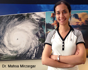
Researchers at the University of Utah are looking for ways to better understand and analyze the set of possibilities that result from an imperfect model. An example of such a model would be the set of possible forecasted paths a hurricane might take from its current position. Dr. Mahsa Mirzargar, a postdoctoral research associate working in the Scientific Computing and Imaging Institute (SCI), has created an analysis and visualization technique for summarizing such model in a meaningful way.
In her paper, Curve Boxplot: Generalization of Boxplot for Ensembles of Curves, Mirzargar and her collaborators, Dr. Mike Kirby and Dr. Ross Whitaker, demonstrated their new methodology by visualizing historical hurricane path data from 50 different hurricane tracks between 1920 and 2012. Recently, they applied this same technique to the simulation output generated by the National Center for Atmospheric Research (NCAR) for Hurricane Joaquin.
“I was excited to apply our technique using recent real-time data collected from NCAR. Using our Curve Boxplot analysis and visualization method we could show the possible paths the hurricane might travel. The scientists at NCAR were happy with the results,” Mirzargar said.
The results denoted possible predicted paths, based upon different models and/or conditions Joaquin might take as of Friday October 2, 2015. Using their Curve Boxplot analysis and visualization method, they show the median hurricane path and the 50 percent band (dark region) — denoting the spatial swath in which 50 percent of the predicted hurricane tracks lie. The light band denotes nearly 100 percent of the possible paths predicted. Red denotes outliers — those hurricane paths flagged as unlikely in reference to all other members of the ensemble.
“I have really enjoyed working on this project,” Mirzargar said. “Working in the SCI Institute at the U is an incredible experience, the collaborative environment provides many opportunities to work on real-world problems. I am so happy that the work that I am doing is making an impact.”

